Luno’s design thinking: our evolution
Upgrading the world to a better financial system is a massive undertaking. So, as big changes are made up of many smaller, subtle shifts, we have to make sure that each new step in our evolution is inspiring, and exciting.
We understand that we need to adapt to better serve and communicate with our customers. So we interrogated our brand and discovered opportunities to make some refreshing tweaks. Here is the story of our brand evolution.
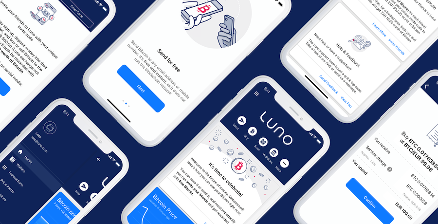
In early 2017 we revealed our rebrand from BitX to Luno to better reflect who we are and where we are heading. The rebrand happened quickly and included creating an entirely new brand, a new website and changes to our native mobile applications. With a short turnaround time and a much smaller team, we were less focused on systems and processes. Instead, we focused on getting the best product shipped as soon as possible.
But a lot has happened since then.
An evolution
In 2018 we expanded to over 40 countries, grew our team to more than 250 Lunauts, opened headquarters in London along with new offices in Africa and Southeast Asia, and saw our customer base grow to over 2 million customers. With these business developments, our thoughts on branding also started to mature.
BitX to Luno was the revolution. This is our evolution.
Why change? Why now?
The revival of the fittest (that’s how it goes, right?). And we truly believe that: if it works, evolve it, don’t reinvent it. Our core business hasn’t changed. More customer adoption means Bitcoin is stabilising. In turn, our business is stabilising. We still have the same reliable Bitcoin and Ethereum wallets, with easy, secure methods of transacting.
This refresh makes it easier to focus on our customers without being bogged down by the details, by creating a strong understanding of our brand. A refresh is the perfect opportunity to self-reflect, and establish the fundamental building blocks we had skipped over in 2017.
As our team met with thinkers and innovators in the field, we realised the impact one company could have on the cryptocurrency industry as a whole. In that ecosystem, we saw that to stay competitive and rise above the noise so prevalent in the crypto space; we had to have one voice, with solid design thinking.
More than just a splash of pink
Design nerds, it’s time to follow our evolution. We made the following changes to our brand elements:
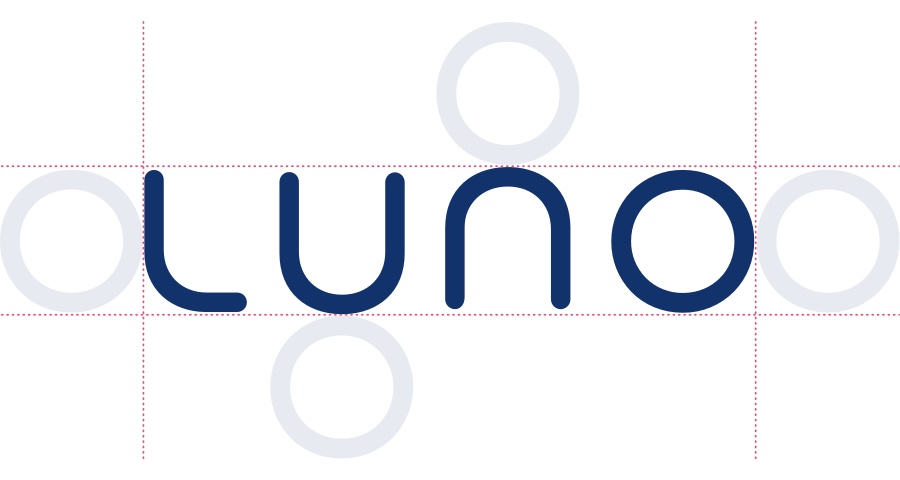
Logo – simplistic and clean
We haven’t changed our logo at all. We didn’t think it needed any tweaks, because it reads well in various regions and the shape works well on all platforms.
Colour – an exercise in contrast
We feel that the best way to fit into our environment is to stand out. To do this, we simplified and unified our colour palette. Before our refresh, we had two hues of blue that didn’t have a strong hierarchy, more greys than we could ever use, and four illustration colours that added brightness, but also seemed childish and didn’t give the messaging the weight it deserved.
Now we’ve focused on four specific colours that tell our brand story:
-
- Moon Blue is our primary colour and is reminiscent of the deep blue hues surrounding the moon when you look up at the night sky.
- Earth Blue is what we call our secondary colour because when looking back at our planet from space, all you can see is a little blue dot. It’s important that we never forget where we come from.
- Future Pink, our accent colour, captures the bright, energetic idealism of the future, like a vibrant sunrise. The future is fuchsia.
- Rocket White, our final accent colour, is a subtle nod to the NASA shuttles, reminding us that we’re pioneering the world into bold, new financial frontiers.
Typography – unique yet native
Apart from our existing native fonts, Roboto for our Android and Web apps and San Francisco for our iOS app, we’ve added a new, warm-hearted font: GreyCliff. This Geometric Sans font was made by independent type designer Connary Fagen. The strong capitals and smooth, open lowercase typography are effective in a variety of applications across both print and web.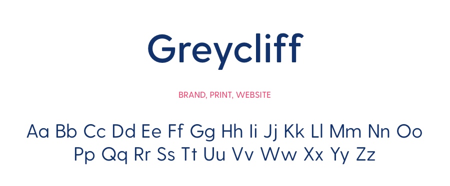
Illustrations – clean lines, limited colour
Our illustrations haven’t changed, but the colours we use to depict them have been simplified, allowing the messaging to stand out more. The simple semiotics of our illustrations translate well across different languages, which is something very important to us at Luno: careful localisation and clear communication. Our illustration style is quirky and light-hearted to demonstrate that the cryptocurrency space can be accessible and friendly.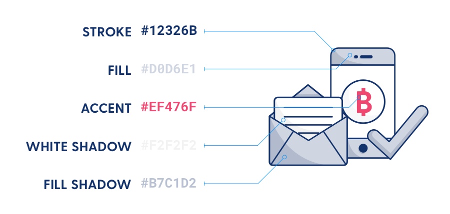
Tone of Voice – encouraging & educational
The proverbial missing link in any brand’s evolution is almost always one thing: language. When we speak consistently, with a tone of voice that is familiar and clear for our customers, we find that missing link with the beauty of words. We understand that for us to help uplift the whole industry and create an accessible financial system for all, our customers need to know they are heard and cared for. We do this by creating easy-to-read educational blogs, with a dash of special spice from our marketing and design teams.
Customer experience – consistently helpful
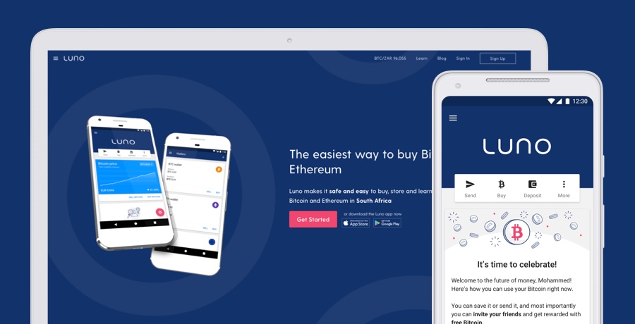
Cryptocurrency platforms can, as a species, be very scary things. Some have a lot of fangs (that look startlingly like candlestick charts), or sharp price graphs that can be quite intimidating. In our progression past this stage of evolution, we’ve learned that the best way to make Luno a friendlier place to buy, store and learn about cryptocurrency is having a consistent customer experience. This conscious decision means customers can trust that this is the same Luno they first saw, perhaps, in an ad while learning about crypto in some blog. And that it’s the same Luno they interact with when using our wallet in the app or on the website.
Watch this space…
From a humble-but-ambitious startup by the name of BitX to the Luno brand we are today, we hope our customers see more of themselves in us. Our brand refresh is more than a structured and considered set of guides – it’s a way for our teams here at Luno to delight and support our customers in new and exciting ways.
 Discover
 Help Centre
 Status
 Company
 Careers
 Press
Press

